Through the Help Desk, we’ll often hear from PricingBrew Journal subscribers who’ve been struggling to get others to embrace their analytical findings.
Typically, these folks have worked hard to assemble and rationalize the most relevant data. They’ve sliced and diced that data rigorously; taking care to ensure apples-to-apples comparisons and control for various factors. And through all of this thoughtful effort, they’ve been able to draw some sound conclusions—about both the problem and the potential solutions.
But when they present their findings to others in their company, they’re sometimes met with blank stares, as though no one really “gets it”. In other cases, there’s a cloud of apathy and no one even seems to care. And very often, the people they’re presenting to seem to spend all their time just picking at the data…pick, pick, pick…rather than focusing on what that data is saying.
While it’s hard to point to a single factor, these kinds of reactions often have less to do with “what” is being presented and more to do with “how” it’s being presented.
At this point, I’m going to insert a little allegory that may seem a bit off topic. But bear with me…I promise that it’s leading somewhere…pun intended…
Imagine you’re charged with getting a group of blind hikers to a remote cabin in the middle of a dense forest. You don’t know how to get there, so while the rest of the group waits at the edge of the forest, you forge ahead to identify the best route. After you finally reach the cabin, what do you do?
Do you just crawl up on the roof and start waving your arms? “I found it! I found it! The cabin is right here!” Of course not. You go back to where you started. And step by step, you lead the group to the destination…using what you’ve learned through your own travails to make the journey as efficient and trouble-free as possible for everyone else.
When presenting a pricing analysis, it’s tempting to lead with the data and the conclusions. After all, you’ve done all this analytical work. You’ve sliced and diced the data a dozen different ways. And you’ve cranked out all kinds of charts, graphs, tables, and scatterplots along the way. So it just seems logical that you’d lead with the products of all this time and effort you’ve expended.
But here’s the thing…you’ve already reached the cabin. The people you’re presenting to are very likely still back at the edge of the forest. And while they may not be entirely blind, things might be fuzzy enough for them that a blizzard of charts and graphs will only impair their vision further.
If you’re struggling to get others to embrace your analytical findings, think hard about “how” you’re presenting the “what”…
- Are you telling a relatable story? Maybe even a mystery? Or, are you throwing up charts and graphs, hoping others will somehow pick up the plot?
- Are you leading others from the problem down the path to the solution? Or are you starting with the solution and working backwards?
- Are you using your most incisive data as a supporting character? Or have you inadvertently and mistakenly cast the data in the leading role?
Be honest…are you just standing on the roof of the cabin, waving your arms? Or are you leading others to the destination…step by step…down a trail you’ve already blazed?
Boosting the Pricing Team's Influence
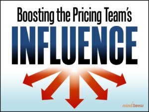
How can a B2B pricing team improve results when they don't control all the cooks in the kitchen? How can they be heard when others don't have to listen? In this session, learn the science of influence and persuasion.
Tales from the Trenches in B2B Pricing
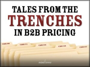
Pricing improvement in B2B can be a messy affair. In this on-demand webinar, glean insights from ten cautionary case studies so you don't repeat the same mistakes and miscalculations.
Making Change Happen
How do you get executives to recognize a need for change? How do you get an organization to move away from the status quo and actually embrace doing things differently? How do you foster true adoption, as opposed to merely forced compliance?